
Trading Tutorials
How to Read Candlestick Charts: A Beginner's Guide With Real Examples
One candle shows four prices — open, high, low, close — and the battle between buyers and sellers in a single period. Learn candle anatomy, the six patterns worth knowing, volume confirmation, and the mistakes that trap most beginners.

Here is the short answer up front: one candlestick summarizes four prices for one time period — the open, the high, the low, and the close. On a daily chart, each candle is one day; on a 4-hour chart, each candle is four hours. If the close is higher than the open, the candle is usually drawn green (price went up during that period). If the close is lower than the open, it is drawn red (price went down).
One important caveat before anything else: the red/green convention is not universal. Most international crypto exchanges and charting tools (Binance, TradingView and others) use green for up and red for down, but in some markets — most notably mainland China's stock market — the convention is reversed: red means up and green means down. If you learned charts from A-share screenshots and then open Binance, everything will look upside down. Always check which convention your platform uses before reading anything into the colors.
Everything else in candlestick reading builds on that simple four-price summary. Let's break it down properly.
The Anatomy of a Single Candlestick
Every candle has two parts:
- The real body — the thick rectangle between the open and the close. A green body means the close sits at the top and the open at the bottom; a red body means the opposite.
- The wicks (or shadows) — the thin lines above and below the body. The tip of the upper wick marks the highest price traded during the period; the tip of the lower wick marks the lowest.
A quick self-contained example. Suppose a BTC/USDT daily candle opens at $64,200, trades as high as $65,100, dips to $63,800, and closes at $64,900. The body stretches from $64,200 to $64,900 and is green, the upper wick reaches up to $65,100, and the lower wick reaches down to $63,800. Four numbers, one picture — that compression is exactly why traders prefer candles over plain line charts, which only show closes and throw away the story of what happened inside each period.
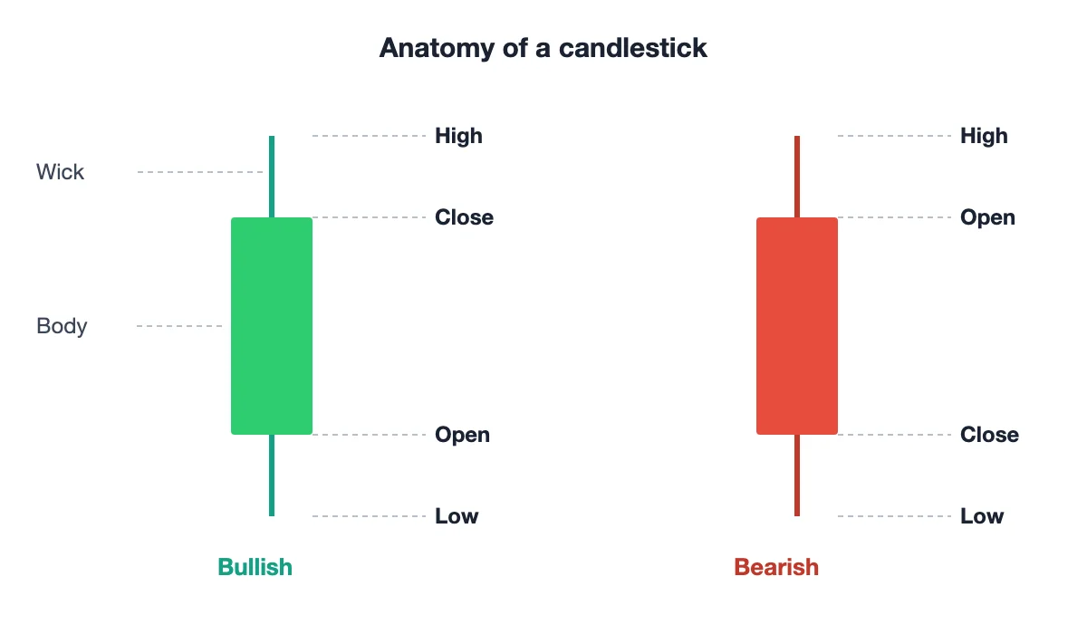
Bodies and Wicks: Reading Buying and Selling Pressure
Once you know the parts, the real skill is interpreting them as a tug-of-war between buyers and sellers:
- A long body means conviction. A long green body says buyers were in control from open to close; a long red body says sellers were. The bigger the body relative to recent candles, the stronger the statement.
- A long upper wick means price pushed higher during the period but was rejected — sellers stepped in and drove it back down before the close. Buyers tried, and failed, to hold higher prices.
- A long lower wick is the mirror image: sellers pushed price down, but buyers absorbed the selling and dragged it back up. That is often read as demand defending a level.
- A small body with long wicks on both sides means indecision. Price traveled a lot but ended near where it started — neither side won.
None of these signals is a command to buy or sell. They are snapshots of who was winning during one period. Context — the surrounding trend, nearby support and resistance, and volume — decides whether the snapshot matters.
Choosing a Timeframe: Why Beginners Should Start With the Daily and 4-Hour
The same market drawn on different timeframes tells very different stories, and picking the wrong one is a classic beginner trap.
- 1-minute and 5-minute charts are for scalpers. Each candle reflects a handful of trades, so "patterns" appear and fail constantly. This is mostly noise unless you are executing dozens of trades a day with tight spreads and fast fingers.
- 15-minute to 1-hour charts suit active intraday trading, but they still demand screen time and quick decisions.
- 4-hour and daily charts are where candlestick logic works best for most people. Each candle aggregates enough trading activity that a long wick or an engulfing candle actually represents a meaningful shift in supply and demand, not one whale's market order.
- Weekly charts are excellent for the big picture but too slow for most trade timing.
Beginners should start with the daily chart, and add the 4-hour once comfortable. Three reasons: signals on higher timeframes are statistically more reliable because they summarize more activity; you get hours or days to think instead of seconds; and you cannot overtrade a chart that only prints one new candle per day. Crypto markets trade 24/7, so a "daily" candle typically closes at 00:00 UTC — worth knowing, since traders around the world watch that same close.
Reading a Real Chart
Theory is easy; real charts are messy. Below is a real BTC/USDT daily chart from Binance (data as displayed on TradingView/Binance, captured in July 2026).
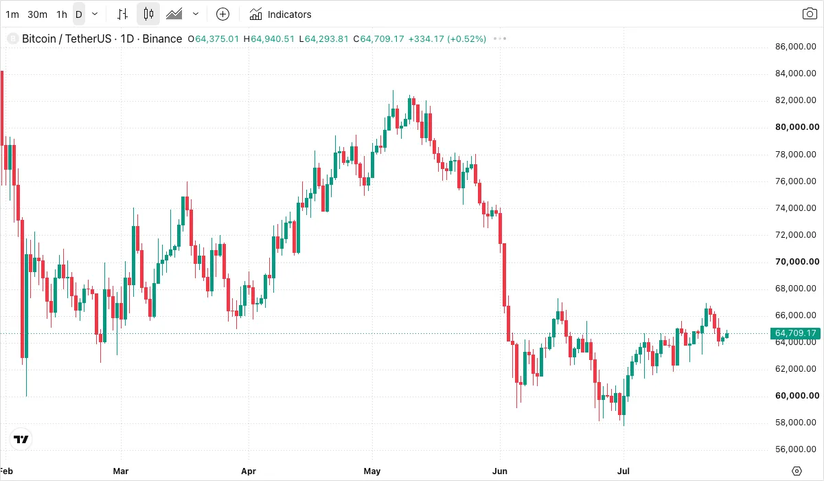
Use it as a spotting exercise before you read on:
- Find the longest body on the chart. Was it green or red? Notice how the candles right after it tended to continue in the same direction for a while — that is what conviction looks like.
- Find a candle with a conspicuously long wick. Ask yourself which side got rejected. A long upper wick after a rally is a very different message from a long lower wick into support.
- Find a candle whose body is almost invisible — open and close nearly equal. That is a doji, the indecision candle we cover next.
If you can pick those three things out of a live chart, you already read candles better than most people who have memorized fifty pattern names.
Six Candlestick Patterns Every Beginner Should Actually Know
There are dozens of named patterns. You need six.
1. Long bullish / long bearish candle
Looks like: a body much taller than recent candles, with small or no wicks. Means: one side dominated the entire period — strong momentum in that direction. Common misreading: chasing it. By the time a huge green candle closes, much of the move has happened; buying the close of a giant candle often means buying someone else's exit.
2. Doji
Looks like: open and close almost identical, so the body is a thin line, usually with wicks both sides. Means: indecision. After a strong trend, a doji hints the dominant side is running out of steam. Common misreading: treating every doji as a reversal signal. In a sideways, low-volume market, dojis are everywhere and mean almost nothing. A doji only matters after a clear directional move.
3. Hammer
Looks like: a small body near the top of the candle with a long lower wick (at least twice the body), appearing after a decline. Means: sellers pushed price down hard, but buyers bought it all back — potential exhaustion of the downtrend. Common misreading: ignoring location. The identical shape in the middle of a range, or after a rally, is not a hammer signal. The pattern only earns its name after a fall, ideally near a support level, and it still needs confirmation from the next candle.
4. Hanging man
Looks like: exactly the same shape as a hammer — small body, long lower wick — but appearing after a rise. Means: despite the up-move, sellers were able to drive price down hard intraperiod. Buyers rescued the close, but the rejection reveals distribution pressure; a warning, not proof, of a top. Common misreading: shorting it immediately. A hanging man is a weak signal on its own and is only worth acting on if the next candle closes lower, confirming that sellers followed through.
5. Bullish engulfing
Looks like: a red candle followed by a green candle whose body completely covers the previous red body. Means: buyers not only stopped the decline, they reversed everything sellers achieved in the prior period — one of the more reliable bottoming hints, especially at support with rising volume. Common misreading: counting a green candle that only engulfs a tiny red one. Engulfing a small, meaningless body is a small, meaningless signal. The prior candle should be a real down candle for the reversal to mean anything.
6. Bearish engulfing
Looks like: the mirror image — a green candle followed by a red body that fully swallows it. Means: sellers overwhelmed the buyers' entire previous period of work, often marking a local top after an extended rally. Common misreading: using it against a strong uptrend to call "the top." In powerful trends, bearish engulfings frequently produce only a shallow dip before the trend resumes. Counter-trend signals need far more supporting evidence than trend-following ones.
Volume: The Lie Detector for Patterns
A candlestick tells you what price did; volume tells you how many participants agreed. The rule of thumb:
- A reversal pattern (hammer, engulfing) on high volume — noticeably above the recent average — is far more credible. Real money changed hands at that turning point.
- The same pattern on thin volume is easy to paint and easy to fail. In crypto, low-liquidity hours and small-cap pairs produce beautiful, worthless patterns constantly.
- A breakout candle without a volume expansion deserves suspicion by default.
Before acting on any pattern, glance at the volume bars beneath the chart. It takes two seconds and filters out a large share of false signals.
Three Mistakes Almost Every Beginner Makes
- Treating one pattern as a holy grail. No candlestick pattern wins even close to 100% of the time. A hammer at support in an uptrend might tilt odds meaningfully in your favor; the same hammer in a random spot is a coin flip. Patterns are inputs to a decision, never the decision itself.
- Reading tiny timeframes as if they were meaningful. On a 1-minute chart, a single moderately sized market order can print a "hammer" or an "engulfing." Beginners see signals everywhere, overtrade, and bleed out through fees and noise. Stay on the daily and 4-hour until you are consistently profitable there.
- Ignoring the trend context. A bullish pattern inside a brutal downtrend is a lottery ticket, not a setup. The old line — the trend is your friend — survives because counter-trend candlestick signals fail far more often than trend-aligned ones. Always ask: what is the bigger picture doing on the timeframe above mine?
The Honest Conclusion: Probabilities, Not Predictions
Candlestick patterns do not predict the future. At best, a well-located pattern with volume confirmation shifts the odds a few percentage points in your favor. That is genuinely valuable — but only if you pair it with risk management: position sizes small enough that any single trade cannot hurt you, a pre-defined invalidation point (for a hammer, typically below its low), and the discipline to take the loss when the market disagrees. Traders who survive treat candlesticks as a language for reading crowd behavior, not a crystal ball. Learn the six patterns above, demand context and volume before trusting any of them, and let risk management do the heavy lifting.
FAQ
Are candlestick charts enough to make trading decisions? No. Candles describe price behavior; they say nothing about position sizing, macro conditions, or what happens next. Use them as one input alongside support/resistance, trend, volume, and — above all — a risk plan.
Which timeframe is best for reading candlesticks? There is no universally "best" one, but the daily and 4-hour charts offer the best signal-to-noise ratio for beginners. Move to faster charts only after your process works on slower ones.
Do candlestick patterns work in crypto the same way as in stocks? The logic — reading buyer/seller pressure — transfers fully. Differences: crypto trades 24/7 (so daily candles close at 00:00 UTC rather than at an exchange bell), and thin altcoin pairs produce more fake patterns. On major pairs like BTC/USDT, candles behave much as they do in any liquid market.
Should I memorize dozens of patterns? No. Mastering the six in this guide — plus the underlying body/wick logic that generates all patterns — beats a shallow memory of fifty names. Once you understand why a hammer means what it means, you can interpret candles you have never seen a name for.
This article is for educational purposes only and does not constitute investment advice. Crypto assets are volatile; never trade with money you cannot afford to lose.